
Bootcamp Case Study
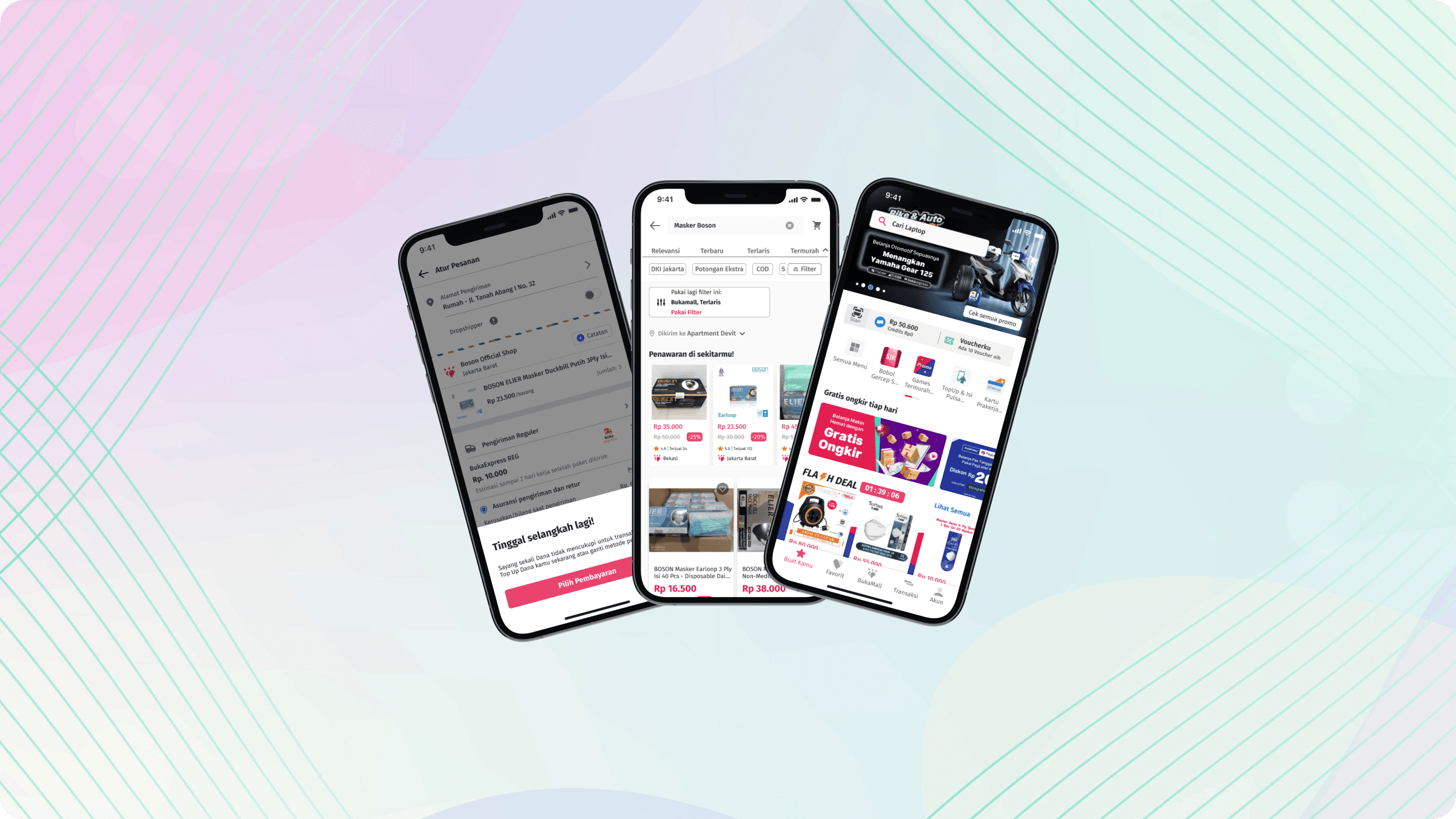
Discovering a new experience in Bukalapak App
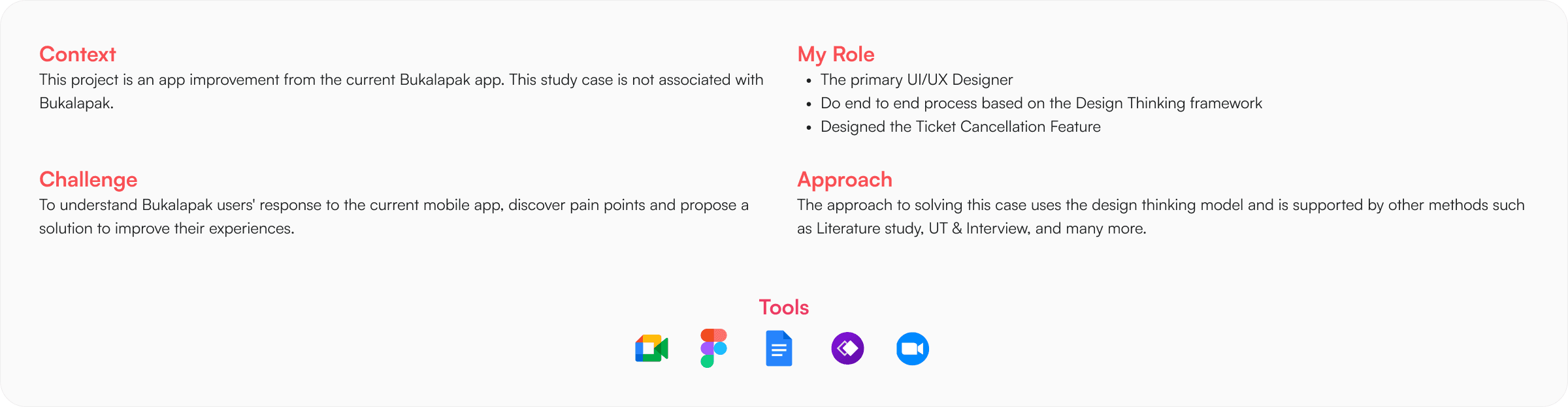
To understand more on the user while using Bukalapak app, I do multiple research to validate the problem from user. from Quantitative Research, Qualitative Research, and Comparative Research. And this is the result on how I exploring the problem and how I solve it.
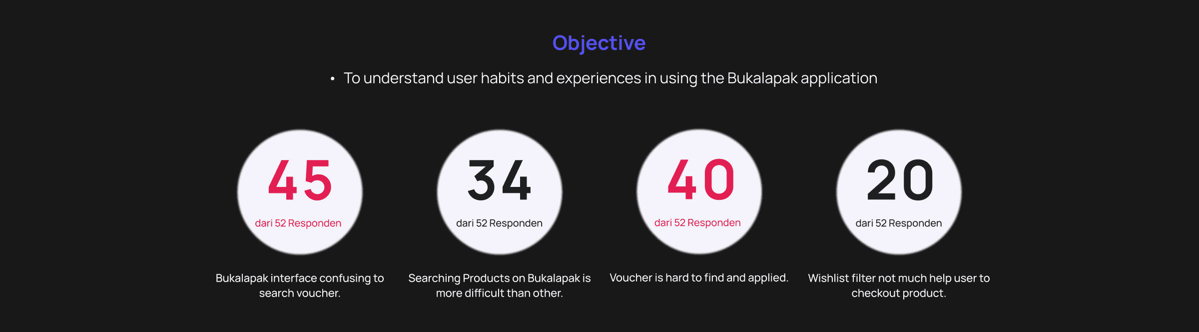
Created user surveys, to determine our target audience and to gain a basic understanding of our users. About 52 responses were recorded. And based on the responses here are the key insights presented below:
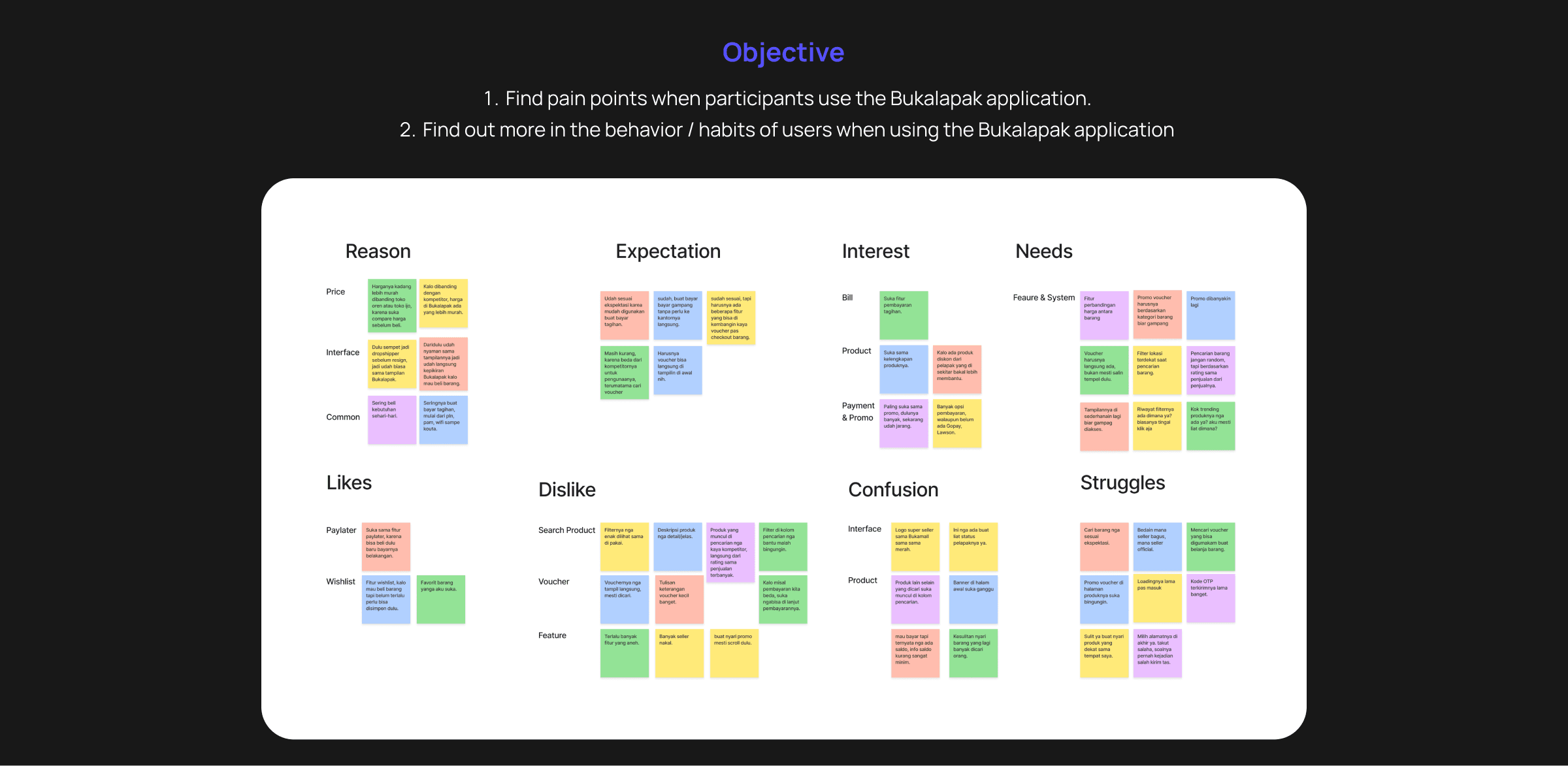
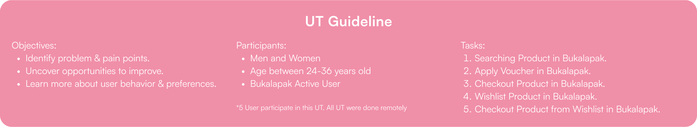
Created the user interview and UT, with 5 user to Find pain points when participants use the Bukalapak application and Find out more in the behaviour / habits of users when using the Bukalapak application. And based on the responses here are the key insights presented below:
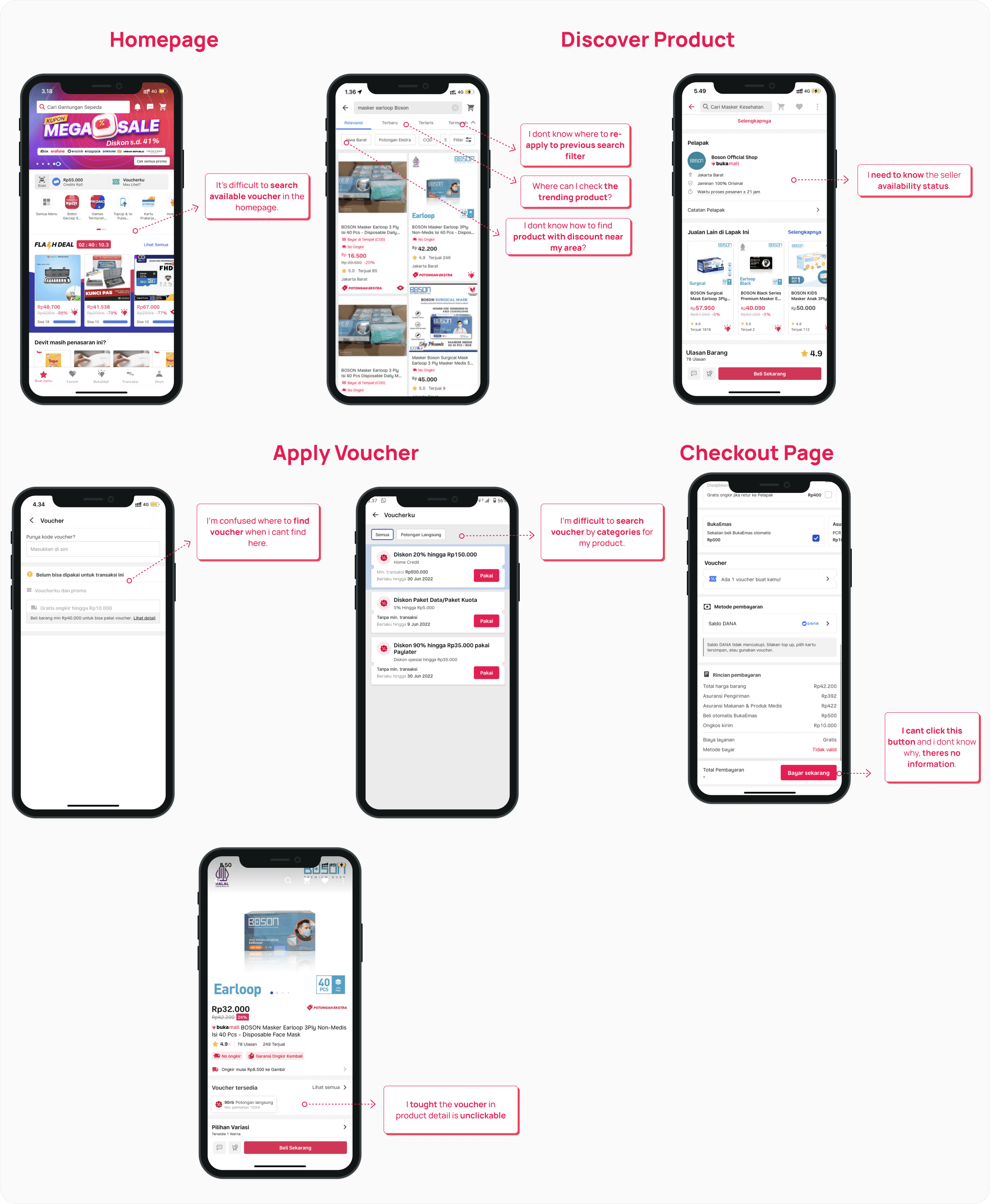
Heres UT finding from usability testing that i find stated below:
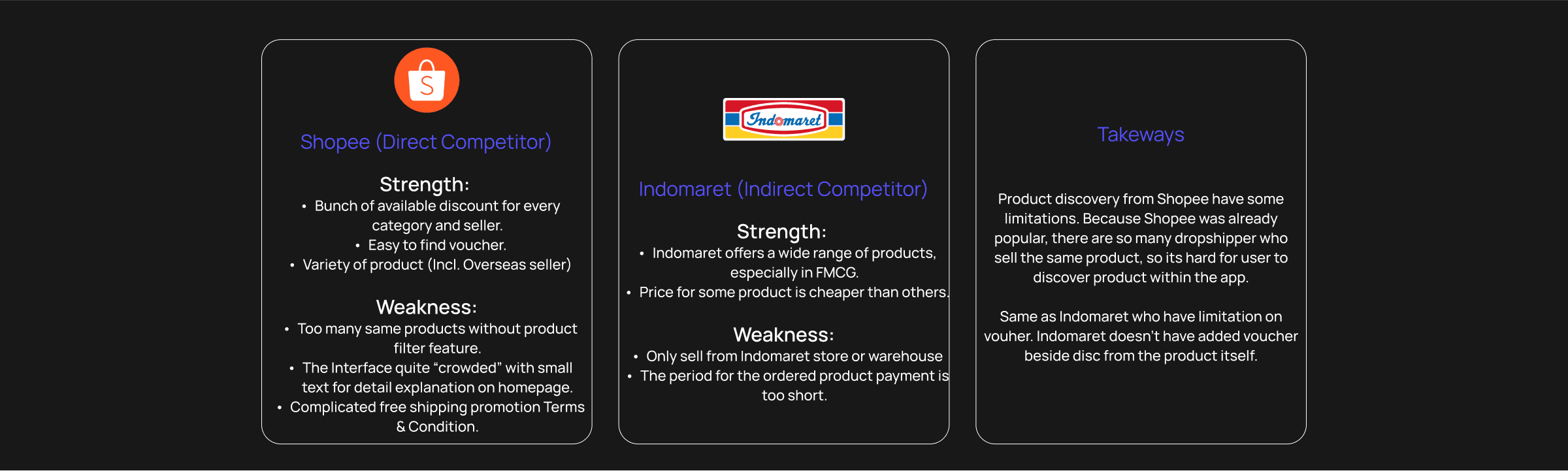
I also do comparative research to find out the opportunities or insights that can be taken for my case study this time. where I got 2 comparisons, namely from Shopee as a direct competitor and Indomaret as an indirect competitor.
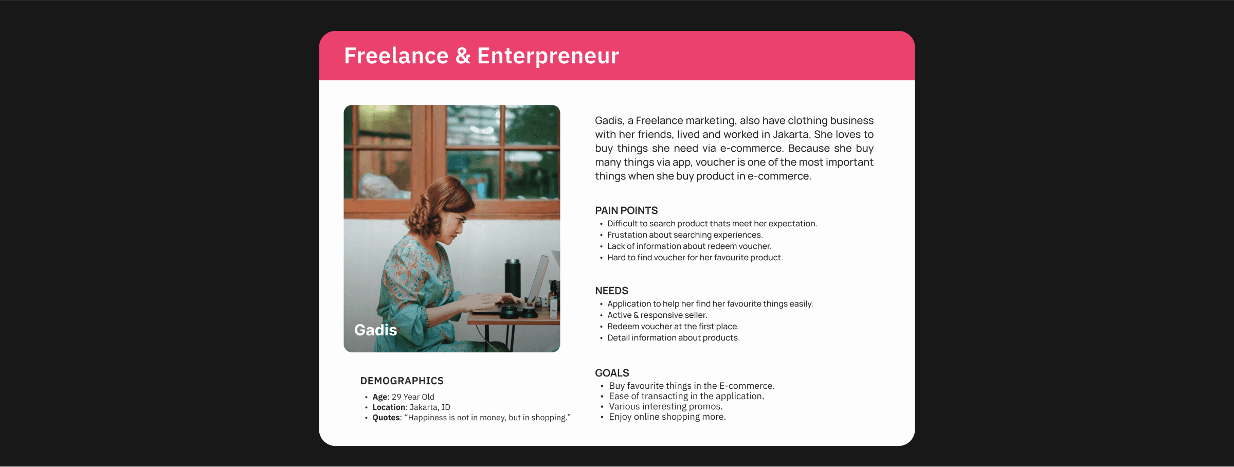
Here I use a user persona to visually describe the ideal figure of a user.
I started by writing down some problem statements from the research results
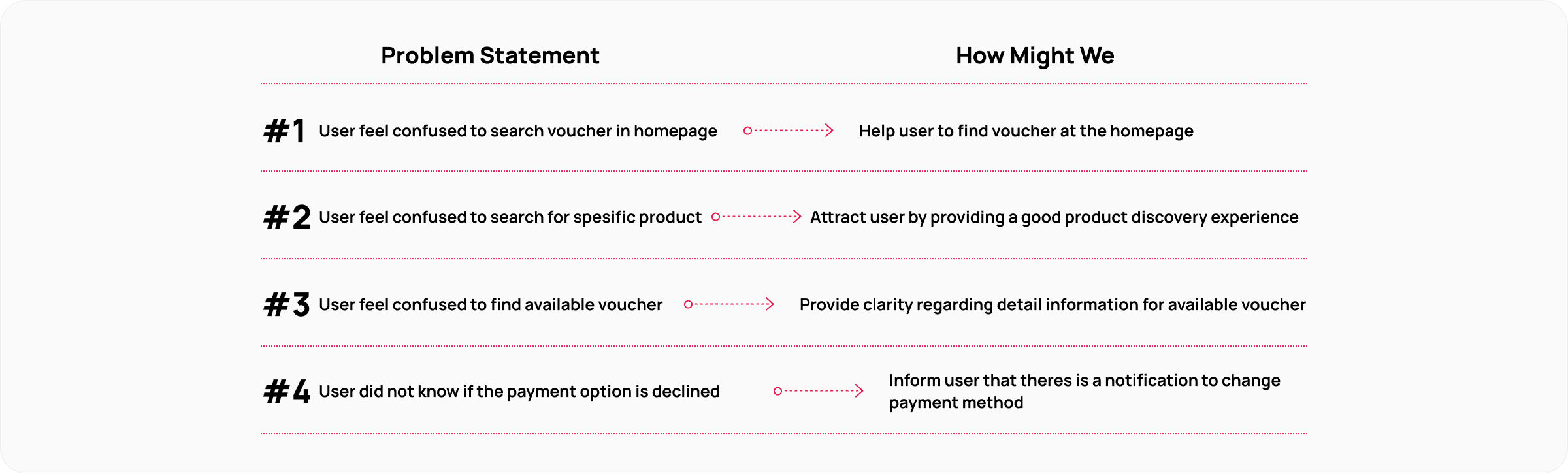
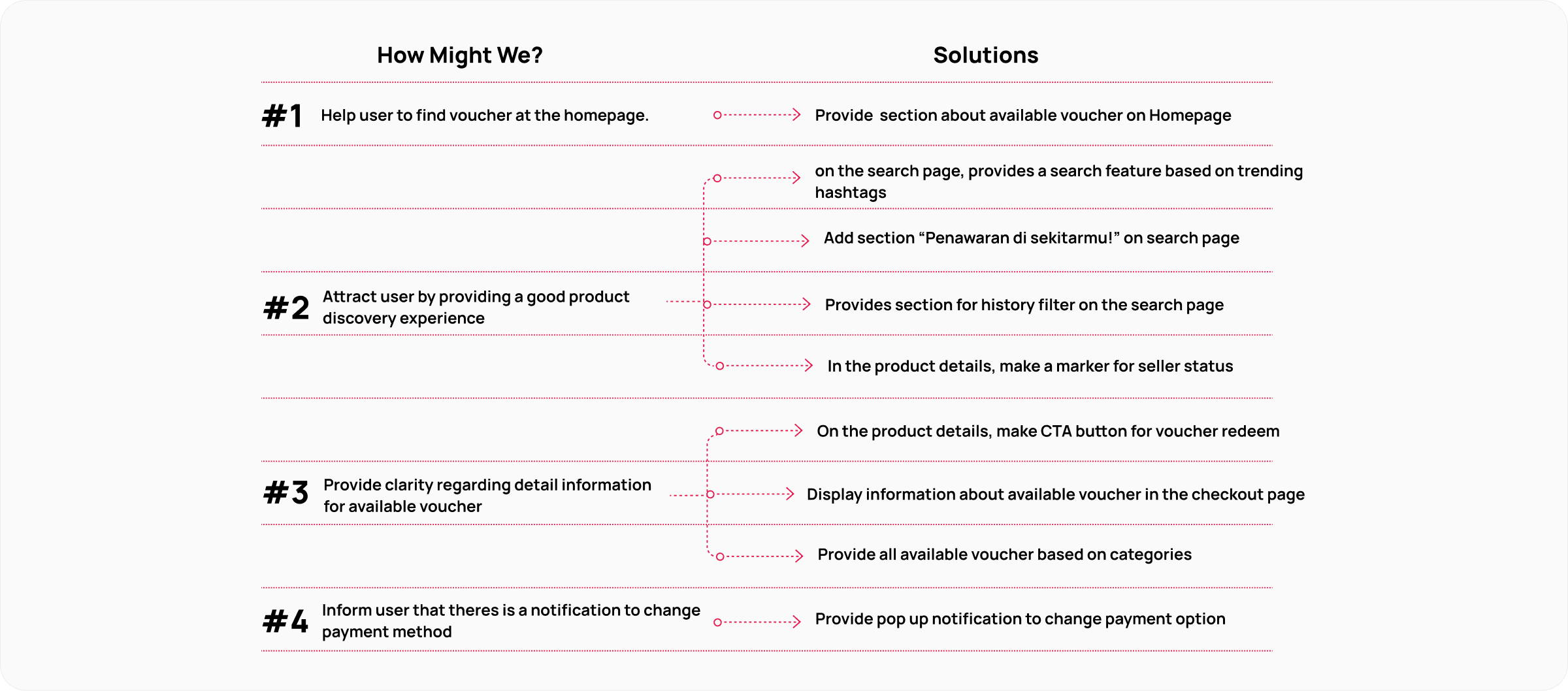
And this is my HMW and Solutions design improvement this time, where there are 4 HMWs with a total of 9 design solutions which I will explain in more detail in the priority matrix section.
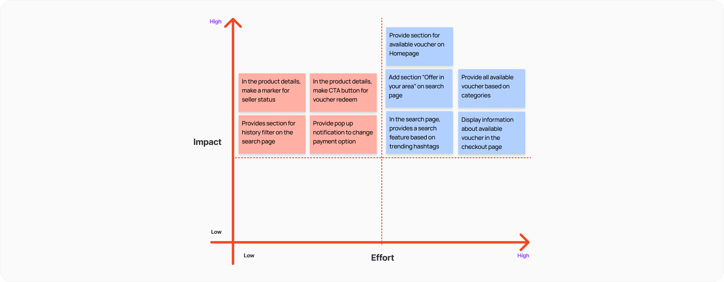
Here, I use a prioritization matrix to objectively project the suitability of my idea with the available time.
I created a user flow that the user uses as a flow to search for products and look for vouchers. which I will visualize later in the form of a wireframe.

At this stage I started by showing some wireframe lofi for my design.
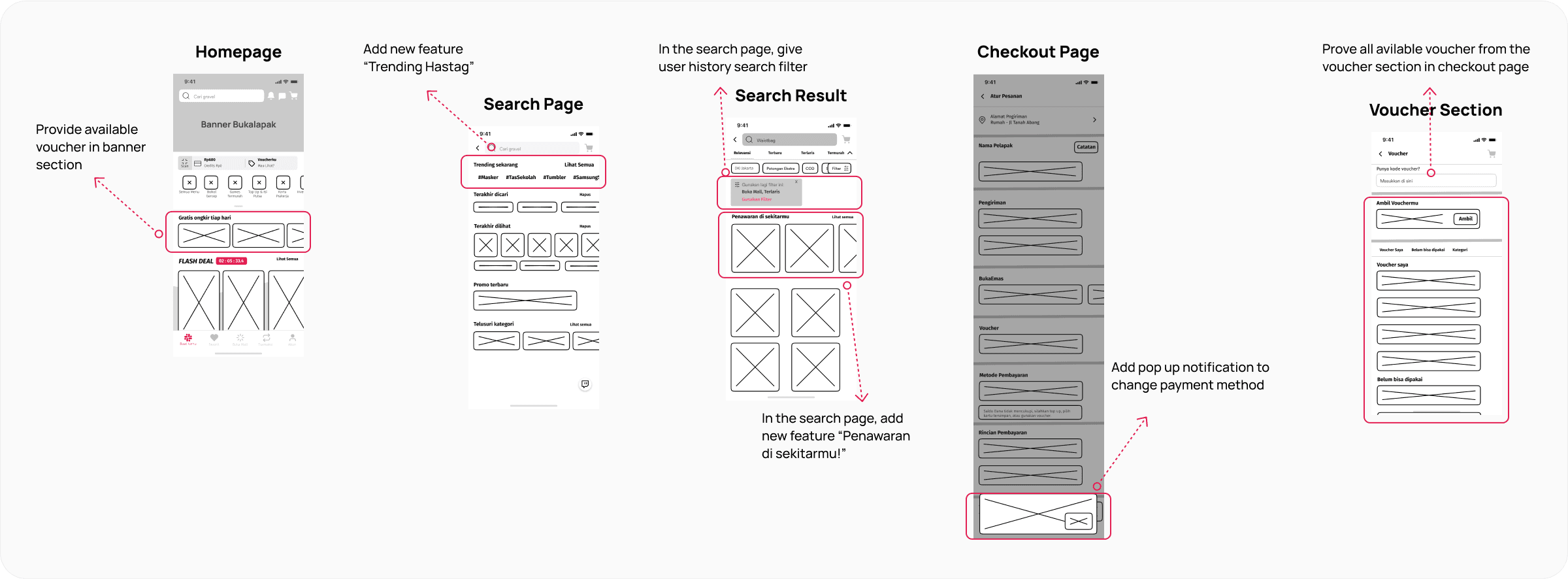
From the wireframe above, which then becomes this wireflow with a flow starting from the homepage and ending at the checkout page. to explain the flow when a user searches for a product and redeems a voucher to buy a product.
Next is the style guide that I use which consists of a color palette, typography, icons and components.
And here's a Hi Fidelity wireframe. To make visualization easier, I present it with before and after redesign. and here I present per HMW, where as at the beginning, there are 4 HMWs that I try to visualize into designs.
Disini saya melakukan testing dengan 2 cara, yaitu virtual UT dengan partisipan 3 orang melalui gmeet, dan physical UT dengan partisipan 2 orang. di tahap ini saya menugaskan partisipan untuk melakukan 3 tugas yaitu: 1. search product, 2. apply voucher dan 3. checkout product. Dengan average completion rate adalah 90%.

And this is the feedback & iteration that I did after testing.

Share


Devit Rahman
Copyrights 2024. All rights & wrongs reserved